Thursday 24 May 2012
Wednesday 23 May 2012

Tuesday 22 May 2012
Final Promotional Poster

Friday 10 February 2012
Thursday 9 February 2012
Wednesday 8 February 2012
Task 4: Media Technology in DigiPak and Poster
When creating our CD digipak and poster we had to first take a set of photographs that we could then edit to create our final products. We took these pictures on a Cannon 500D to catch high quality pictures that we could then play around with to create a final image representing our artist.
We used the program PhotoShop to edit our pictures. We needed to create a 6 panel CD digipak and an advertisment poster to compliment our pop promo video. Photoshop is a image manipulation device which allows us to create new images from outstanding ones. How To Use PhotoShop

We chose the images we wanted for our products and then started work first on the CD digipak. We got a template from the internet of a 6 panel CD pack and then layered the images up against this. We edited 4 pictures on their own before adding them to the template. The main image for us to edit was the front cover which we did by selecting the picture and then cropping it to fit the square frame. We then duplicated the layer to enable us to airbrush the image of our artist to create a flawless 1920's look. We created another layer to add the text in which we were able to choose the font of our choice for our artist. We chose a font that we wanted throughout the ancillary texts to create a sense of synergy. We got pictures of art deco frames and lines which we added ontop of our own photos to highlight the 1920's era and link the text back to our video. We then used the colour manipulation tools to alter the lighting and contrast of the image to look like the colours we used in the video. We did similar things for the other panels where we used the 'eye dropper' tool to choose a colour from our video and then place this on the panel.
 When creating our poster we chose to follow the idea of one of our digipak panels which would create a sense of synergy. We used the eye dropper tool to select the same colour as the panel and then chose the same silhouette image of the dancer to place on our poster. We did this by using the marquee tool to draw around one of the three silhouettes and then copy and paste it onto the poster. We then used the transform tool to scale it to the size we wanted. And added the same font in the similar positioning on the poster as on the digipak. We created a new layer to add text to the poster which included tour dates where the artist would be performing. We saved images of the twitter and FaceBook logo to place on the bottom of the poster in their own layers and then found a barcode on google to place ontop of the poster. Once we had created it we though somethig was missing so we added a new layer and used the brush tool to add a signiture of the artist in a similar colour as what would be found in the video, over the top of the silhouette.


We used the program PhotoShop to edit our pictures. We needed to create a 6 panel CD digipak and an advertisment poster to compliment our pop promo video. Photoshop is a image manipulation device which allows us to create new images from outstanding ones. How To Use PhotoShop

We chose the images we wanted for our products and then started work first on the CD digipak. We got a template from the internet of a 6 panel CD pack and then layered the images up against this. We edited 4 pictures on their own before adding them to the template. The main image for us to edit was the front cover which we did by selecting the picture and then cropping it to fit the square frame. We then duplicated the layer to enable us to airbrush the image of our artist to create a flawless 1920's look. We created another layer to add the text in which we were able to choose the font of our choice for our artist. We chose a font that we wanted throughout the ancillary texts to create a sense of synergy. We got pictures of art deco frames and lines which we added ontop of our own photos to highlight the 1920's era and link the text back to our video. We then used the colour manipulation tools to alter the lighting and contrast of the image to look like the colours we used in the video. We did similar things for the other panels where we used the 'eye dropper' tool to choose a colour from our video and then place this on the panel.

We also created a few different posters in photoshop that we decided we didnt want to use as our final poster. These followed the same similar ideas as the final poster, we just used the colour contrast and highlighter tool to get the block effects which we then selected and added different colurs to.


Task 4: Media Technology in Pre-Production
Before filming our pop promo we drew up a storyboard of how we wanted our video to look. This included drawing each shot in their own box and then linking this to the timing of the video and the lyrics of the song. We then stuck these up on the wall in order of shots so that we could film each 'shot box'. We used a Sony NX 5 to shoot the storyboard. We then edited all the 'shot boxes' together on Final Cut Pro and synced it all up with the song. From this we got an idea of what our actual video could look like, we realised that we didnt like a couple of the shot choices so were able to changethese before the shoot day. Thus, this media technology was a significant part in our pre-production and our music video may not have turned out as well without our anamatic storyboard.

The use of blogger has in itself been a vital aid to our pre production. We have been able to post articles and share images and ideas with the rest of our team through the idea of blogging. It has acted as a scrapbook throughout the pre production phase of our pop promo and keeps everything together in one place in an organised fashion. Here is a web link to the basic idea of blogging. How To Blog
The Web 2.0 has helped us greatly with our pre production. We have been able to look up videos that are relevant to our pop promo and that we could draw out ideas from. We were able to use the website YouTube to research into real media texts before creating our own. This was very helpful when planning out our zoetrope idea as we werent sure how we would shoot this. We looked at many different videos on the website but the two that generated the most ideas with us were the Coca-Cola advertisment from the World Cup and then the Sony Bravia advertisment. Here is the video which helped us so much.
We also used the website Google to search up ideas relating to our pop promo and we got images that we could use in the after effectselement of our video. This helped us get a better idea of what our video would turn out to look like. Without this pre production element our pop promo would look alot different and wouldnt be anywhere near as interesting to watch.

We needed to plan a photoshoot with our artist to get images that we could use on our final digipack and poster. For this we planned a shoot at the end of filming so that we could use thesame set as our video used. We had previously researched real media texts of similar ideas on the internet to help us plan out our photos that we needed to take. We used a Cannon 500D to take these shots and then used photoshop to edit them accordingly.

Sunday 5 February 2012
Sunday 29 January 2012

Friday 27 January 2012
Feedback on Evaluation Task 3: Audience Feedback
Please post focus group video and You Tube comments. Please complete feedback and evaluation task over the weekend.
Many Thanks
Many Thanks
Monday 23 January 2012

Feedback
I like the prezi and would love to see the use of more images. I think the work on Dyer and star image is quite well done, but over all you do not really get to grips with the idea that the MV, CD digpak and poster are all part of the same promotional campaign which is a consistent and sustainable marketing of the bands image. It is this discussion of the marketing mix (Philip Kotler) including the product placement whcih I feel is an imporatnt task required for this evaluation. I do feel that you need to addess the question set more closely. I would also like to some discussion of the importance of audience recognition of the campaign.
Sunday 22 January 2012
Saturday 21 January 2012
Saturday 14 January 2012
Feedback
A good presentation. It can be developed further - after you have published your final music poster for the campaign. I do feel that you need to make more use or links to real media products to illustrate the conventions used. you also need to address the evaluation task set - this could take the form of a written entry which assesses how you have used, developed or challenged conventions. Use the reading from class notes to assist you with this.
Wednesday 11 January 2012
Sunday 27 November 2011
Feedback
Good reflection on the CD digipak design with evident evaluation. I like the way that you reflect on the use of audience feedback, but I feel that you could have developed this in more detail. I also like the way in which you make reference to real media products - existing artists and consider how this influences the concept for your digipak. Well done.
Wednesday 23 November 2011
Evaluation of CD DigiPak and Poster
When coming up with idea for our CD cover design, we had to think about the conventions used in the design for each. When it came to the CD digipak we really struggled to decide upon a final idea. In the end we chose to follow along the lines of pop art as it seemed to fit a similar era of music. We wanted to make the CD cover eye catching so that people would be more enthusiastic to buy the CD, especially as she is a new artist. We knew we needed to make it colourful and therefore stayed away from using black and white which was one of our ideas. For the poster we wanted to focus on the main girl in a way to show her off as she was the main artist and what we wanted to promote. For this we came up with a few different images that would be released so people could either collect all 3 or choose their favourite. We needed to make her name big on both the cover and magazine as she was a new artist and therefore just an image would not be enough information for the public.
When looking at existing media products, we saw a Michael Jackson cover for his album 'jbhfujebgjre' which we took great inspiration from. The cover was eye catching and interesting and looked at iconic images from the style of pop art from Andy Warhole. We thought that this would be appropriate as the Artist Marylin Monroe had a famous image done by Andy Warhole which is one of his most iconic pictures. Our star would target a similar audience and style, therefore we thought using pop art would be an interesting twist and take on history - the idea of mixing the old with the new. here is a link to an article that describes the idea behind pop art: http://en.wikipedia.org/wiki/Pop_art

When looking at existing media products, we saw a Michael Jackson cover for his album 'jbhfujebgjre' which we took great inspiration from. The cover was eye catching and interesting and looked at iconic images from the style of pop art from Andy Warhole. We thought that this would be appropriate as the Artist Marylin Monroe had a famous image done by Andy Warhole which is one of his most iconic pictures. Our star would target a similar audience and style, therefore we thought using pop art would be an interesting twist and take on history - the idea of mixing the old with the new. here is a link to an article that describes the idea behind pop art: http://en.wikipedia.org/wiki/Pop_art

We started off the design process by drawing our what we wanted the CD cover to look like, this helped us when it came to the photoshoot as we knew which shots to take and how we wanted them to be edited. When creating the poster and CD cover we used Photoshop to adjust the image and edit them appropriately. We first airbrushed the image buy doubling the layer and erasing any blemishes, this creating a flawless look (which was also fitting of the style of women in the 1920's). Once we had done this we adjusted the light to create a vintage look for the Cd colour, this is when the idea of having a pop art style came about. We created many different coloured versions and then picked out our favourites that would make it onto the final digipak. Here is a photoshop tutorial which highlights some of the tools we used to create our final products:
I think that we have highlighted the era our star is surrounding very well through use of costume and photstyle along with the editing we did to create the final image. When it came to highlighting the difference between old and new as we wanted to, we decided to use the old style image but with bold colours surrounding it and the theme of pop art.
Both products would appeal to our target audeince as they show off sophistication, style and glamour. They would be eye catching for those who like dance or techno music as they are bright and colourful, and the style and shot choice for the image would be appealing to those who preffered the old part of her music.
If i could change anything about the products, i would add more images to make it more interesting and less repetitive; although this does highlight the style of our video too. I would maybe add some silhouettes to the image as they also feature heavily in the video realease of the single.
Over all, i think our chosen images match the style of the music and the star image we wanted to portrey for the artist very well and the products are both eye catching and interesting.
Saturday 19 November 2011
Feedback
This is a good diary account of the shoot day. You need to consider how the images could be better presented, other than simply uploaded to blogger. There is much on how the day progressed, but you also ned to consider what role you had in the shoot in terms of set design and camerwork. Did you direct any shots for examples, were there any significant moments for you in production?
Friday 18 November 2011
CD Pack and Poster Idea
CD Cover Idea
Poster Idea:
We had the idea of creting a few different posters for people to collect:

Thursday 17 November 2011
Treatment of CD cover and Poster
For our CD pack we had a few ideas that we tried out using photoshop.
The first idea was of using a different image for the front and back covers. The first would be of the main singer only, we wanted this picture to be a close up with her in her 1920's costume and hair and make up. It would be edited using photoshop to manipulate the colour and make it look more like an old photograph rather than a CD cover. The name of our artist would appear vertically down the side of the front cover in a fancy red font.
The back cover would be a photo of the main singer and the 4 dancers, this would be on the set of the video with the pillars in the background to add sophistication to the image. We would write the track names vertically down one of the pillars in a red or black font, this would contrast with the older style and colours of the image.
The middle page would show the lyrics of the song on a plain black background, the text would be in red font.
IDEA 2
Our second idea would use the image of the front cover from the previous treatment, except the colouring would be different, we would make the image more like Andy Warholes pop art of Marilyn Monroe. Then for the back cover we would use the same image but again change its colouring, this would occur through each face of the pack. This idea came from a Michael Jackson album cover that we happened to stumble across whilst searching for ideas.
AFTER TRYING BOTH, WE DECIDED THAT WE LIKED THE POP ART VERSION BETTER, AS IT WAS MORE APPEALING TO THE EYE AND WOULD ATTRACT MORE PEOPLE TO BUY THE CD.
THEN! For our poster to promote the CD, we wanted to use an image of the main singer, slightly different to the one on the CD cover and make many different versions of this for the fans to collect.
We wanted to have a portrait image of the singer taking up the majority of the poster, and then separate sections of the poster into blocks of different colours.
We would make different versions of the colours for example, bright neon colours, black and white, greys and pastel colours. These each compliment a different element of the artists star image, a theory Dyer highlights in particular.
List of Shots Taken on Shoot Day
Whilst on the shoot day we managed to take some notes with which shots we filmed in which order. This list will help us greatly through the editing process.
Part 1 - Opening Dance
- Two guys freestyle (Blue Background)
- Ben Close Up (Blue Background)
- Tunde Close Up (Blue Background)
- Tunde Extreme Close Up (Blue Background)
- Ben Extreme Close Up (Blue Background)
- Tunde Mid Close Up (Green Screen)
- Ben Mid Close Up (Green Screen)
- Ben Wide Shot Low (Green Screen)
- Tunde Wide Shot Low (Green Screen)
- Connor Wide (Green Screen)
- Connor Wide (Green Screen)
- Mid Close Up Ben (Green Screen)
- Mid Close Up Tunde (Green Screen)
- Close Up Miles (Green Screen)
- Miles Wide Shot (Green Screen)
- Mile Wide Shot Right (Green Screen)
- Miles Close Up Shoes (Green Screen)
- Georgina Wide Shot (Green Screen)
- Georgina Close Up (Green Screen)
- Georgina Close Up Shoes (Green Screen)
- Connor Tap Close Up (Green Screen)
Part 2 - Old Skool
- Two guys clicking (Blue Background)
- Ben Close Up (Blue Background)
- Tunde Close Up (Blue Background)
- Tunde Extreme Close Up (Blue Backround)
- Ben Extreme Close Up (Blue Background)
- Tunde Mid Close Up (Green Screen)
- Ben Mid Close Up (Green Screen)
- Ben Wide Shot Low (Green Shot)
- Tunde Connor Wide (Green Screen)
- Wide Shot Low (Green Screen)
- Connor Wide (Green Screen)
- Conner Wide (Green Screen)
- Mid Close Up Ben (Green Screen)
- Mid Close Up Tunde (Green Screen)
- Miles Mid Left (Green Screen)
- Miles Mid Right (Green Screen)
- Miles Mid Straight (Green Screen)
- Miles Mid Both Sides (Green Screen)
- Miles Wide Shot (Green Screen)
- Miles Wide Shoot Right (Green Screen)
- Miles Close Up Shoes (Green Screen)
- Georgina Wide Shot (Green Screen)
- Georgina Close Up (Green Screen)
- Georgina Close Up Shoes (Green Screen)
- Connor Tap Close Up (Green Screen)
Part 3 - Dance
- Two guys feet kicking (Blue Background)
- Ben Close Up (Blue Background)
- Tunde Close Up (Blue Background)
- Tunde Extreme Close Up (Blue Background)
- Ben Extreme Close Up (Blue Background)
- Tunde Mid Close Up (Green Screen)
- Ben Mid Close Up (Green Screen)
- Ben Wide Shot Low (Green Screen)
- Tunde Wide Shot Low (Green Screen)
- Connor Wide (Green Screen)
- Connor Wide (Green Screen)
- Mid Close Up Ben (Green Screen)
- Mid Close Up Tunde (Green Screen)
- Miles Wide Shot (Green Screen)
- Miles Wide Shoot Right (Green Screen)
- Miles Close Up Shoes (Green Screen)
- Georgina Wide Shot (Green Screen)
- Georgina Close Up (Green Screen)
- Georgina Close Up Shoes (Green Screen)
- Connor Tap Close Up (Green Screen)
Part 4 - Old Skool break
- Tunde Close Up (Blue Background)
- Tunde Extreme Close Up (Blue Background)
- Ben Extreme Close Up (Blue Background)
- Tunde Mid Close Up (Green Screen)
- Ben Mid Close Up (Green Screen)
- Ben Wide Shot Low (Green Screen)
- Tunde Wide Shot Low (Green Screen)
- Connor Wide (Green Screen)
- Connor Wide (Green Screen)
- Ben Cane
- Mid Close Up Ben (Green Screen)
- Mid Close Up Tunde (Green Screen)
- Mid Close Up Tunde MIC (Green Screen)
- Miles Mid Trumpet Flip (Green Screen)
- Miles Close Trumpet Flip (Green Screen)
- Miles Wide Shot (Green Screen)
- Miles Wide Shot Right (Green Screen)
- Miles Close Up Shoes (Green Screen)
- Georgina Wide Shot (Green Screen)
- Georgina Mid Close Up (Green Scren)
- Georgina Close Up (Green Screen)
- Georgina Close Up Shoes (Green Screen)
Part 5 - DANCE
- Tunde Close Up (Blue Background)
- Tunde Extreme Close Up (Blue Background)
- Ben Extreme Close Up (Blue Background)
- Tunde Mid Close Up (Green Screen)
- Ben Mid Close Up (Green Screen)
- Ben Wide Shot Low (Green Screen)
- Tunde Wide Shot Low (Green Screen)
- Connor Wide (Green Screen)
- Connor Wide (Green Screen)
- Mid Close Up Ben (Green Screen)
- Mid Close Up Tunde (Green Screen)
- Miles Wide Shot (Green Screen)
- Miles Wide Shot Right (Green Screen)
- Miles Close Up Shoes (Green Screen)
- Georgina Wide Shot (Green Screen)
- Georgina Close Up (Green Screen)
Part 6 - Break Short Old School
- Tunde Close Up (Blue Background)
- Tunde Extreme Close Up (Blue Background)
- Tunde Mid Close Up (Green Screen)
- Ben Mid Close Up (Green Screen)
- Ben Wide Shot Low (Green Screen)
- Tunde Wide Shot Low (Green Screen)
- Connor Wide (Green Screen)
- Connor Wide (Green Screen)
- Mid Close Up Ben (Green Screen)
- Mid Close Up Tunde (Green Screen)
- Miles Wide Shot (Green Screen)
- Miles Wide Shot Right (Green Screen)
- Miles Close Up Shoes (Green Screen)
- Georgina Wide Shot (Green Screen)
- Georgina Mid Shot (Green Screen)
- Georgina Close Up (Green Screen)
Part 7 - Dance
- Tunde Close Up (Blue Background)
- Ben Extreme Close Up (Blue Background)
- Tunde Mid Close Up (Green Screen)
- Ben Mid Close Up (Green Screen)
- Ben Wide Shot Low (Green Screen)
- Tunde Wide Shot Low (Green Screen)
- Connor Wide (Green Screen)
- Connor Wide (Green Screen)
- Mid Close Up Ben (Green Screen)
- Mid Close Up Tunde (Green Screen)
- Miles Wide Shot (Green Screen)
- Miles Wide Shot Straight On (Green Screen)
- Georgina Wide Shot (Green Screen)
- Georgina Mid Shot (Green Screen)
- Georgina Close Up (Green Screen)
Part 8 - Old School Outro
- Tunde Close Up (Blue Background)
- Ben Extreme Close Up (Blue Background)
- Tunde Mid Close Up (Green Screen
- Ben Mid Close Up (Green Screen)
- Ben Wide Shot Low (Green Screen)
- Tunde Wide Shot Low (Green Screen)
- Connor Wide (Green Screen)
- Connor Wide (Green Screen)
- Mid Close Up Ben (Green Screen)
- Mid Close Up Tunde (Green Screen)
- Miles Wide Shot (Green Screen)
- Miles Wide Shot Straight On (Green Screen)
- Georgina Wide Shot (Green Screen)
- Georgina Close Up (Green Screen)
Tuesday 15 November 2011
Evaluation of Shoot Day
Prior to our shooting day, we painted our set and got hold of all our costumes and props that we would need for the video. We spent a day in the studio previous to filming. During this day we painted the pillars and boxed for our set and built the steps along with setting up the white wash curtain, we then found all of our cast and chose which costumes fitted and suited them the best. all this preparation helped us alot and made the shooting day run alot smoother.
 We started the day at 8.30 and had a group meeting to plan out the day and check everything was ready to go until 8.50 when our cast arrived at the studio ready for the days filming. We began by getting our first morning shoot ready, our cast came in on time and we were ready to start.


The day seemed to be becoming more exiting by the minute; we all had our shifts of working the play back, directing the cast and the camera and checking the light balances between each scene. The morning was taken up of our performance and the dance sections; we had already decided that in post we were to do a lot in silhouette so to make a crisp like we decided to film a lot of the dance more on green screen.
One of the problems of the shoot was a general felling of nervousness amongst the group which unfortunately travelled to our dancers, this made them feel a little uncomfortable, after realising our mood was affecting theirs we had a short group meeting about how we were ok and how we needed to make sure that our cast were ok and not apprehensive. We put on a positive face and caried on with the day successfully.

As the morning carried on we focussed on close ups and mid shots of the boys dancing and the Trumpeter. This meant that we could have our cast in shifts, so they wouldn't get bored of standing around and waiting for too long. They could then be alert and ready for when we need to film them. By the end of the morning we were able to wrap filming on the boys and Miles ahead of the afternoon where we would be using the girl dancers and our main star, Georgie.
After having a short break for lunch, we gathered our girl dancers and got them into costume and make-up, we then spent 10 minutes going over the dance with them and checking they had it down and crisp. We then went onto filming this section, the girls were really good, being performers they knew how to act to the camera and had a lot of personality which showed and made the shots look great.

After wrapping the girls we focussed on shooting the main singer, this would be the focus point of our video and we needed to make sure this looked good. We had previously done a screen test of her and rehearsed her a little bit prior to the shoot. She was such a good performer and acted with such class and sophistication which worked really well for the style of the video.
One particular aspect of the day i focussed on was the camera work. I really enjoyed being able to choose how to frame each shot. Even though we all took turns at each role, working the camera was definitely my favourite part to play.
Overall, the day went very well and we feel we have filmed enough shots to start editing together a rough cut, i really enjoyed the day and was able to use the skills i developed last year to help me with my directing and camera work this year.
Photo's from shoot day!
 |
| Here is a shot of one of our flapper girls |
|
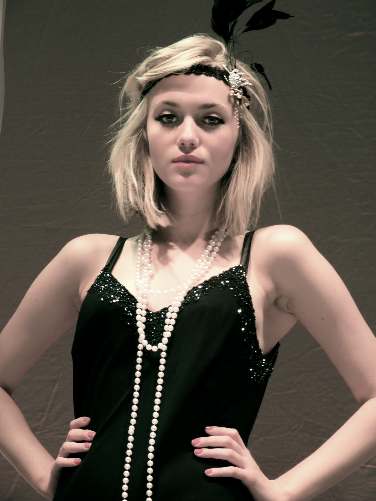
| Here is a close up of Georgie who portreys the role of Dottie |
|
| We thought about using this shot for one of our posters |
 |
| This will hopefully be our CD pack cover |
 |
| We edited this picture on photoshop |
|
| We changed the colour of this photo on photoshop. We really like this picture and want it to appear on our digipak |
 |
| This might be the image on our poster |
Friday 21 October 2011
Feedback
A proficient presentation of the CD digipak design and the importance of album covers. I feel that you could have developed research more into the conventions of Album digipak's and addressed layout and design more closely. Excellent initial design's into CD covers for your group artist and good consideration to target audience. Please do spellcheck your posts and use capitals where necessary at all times.
Wednesday 19 October 2011
Monday 17 October 2011
A New Idea
We had a 'light bulb' moment today with ideas and set designs. We thought of starting the beginning of the music video with a long tracking shot of the woman walking around pillars. We would start the video with a wide shot of some Hollywood dancers running and crossing over. Then we would see the main girl walking down a wide staircase and then tracking her walking around different pillars with objects on them. A bit like a museum with articles from the narrative on it.
There would be 5 pillars with different objects on them:
1. The zoetrope
2. A photoframe with a crack down the glass and a picture of the husband
3. Jewellery (pearl falling down the side)
4. A Cigarette holder, ashtray and lighter
5. The silhouette dancers fedora hat.
As she passes the final pillar we see her look into the Zoetrope and spin it - this leads us into the following shots of silhouettes dancing much like the Coca-Cola advert:
Our dancers would include the following:
Bethany Quinn
Sophie Ritter
Jess Wilson
Paula Riemann
Megan Flook
Georgina Clarke
Sunday 16 October 2011
Feedback
This is highly proficient work - there are evident clear accounts of your planning and research for your music video production day after half term. You have persevered with completing the work this week, well done.
I like the way in which decision making is evident along with reflection and revisions.
You have provided a cast list and you some excellent work on set design.
There are one or two ways to develop the blog. First to begin using a wider range of blogging tools, if you can - there are lots of well presented images, but use of Flickr or powerpoint will increase the creativity that is shown on your blog.
Second the valid, detailed and reflective comments that you make need to be developed further with key media concepts and theoretical ideas; for example, link the planning to star image, or how set design and lighting link to mise en scene and/ or what model's of lighting you are using in relation to your set - key, fill, directional, discuss the intensity and colour and what you are trying to represent about your artist.
This will help make a more thorough evaluation of your work.
Well done.
Friday 14 October 2011
Shooting Schedule
08:30 AM: Gather cast and crew and talk through day
08:45 AM: Get into Costume/Makeup (Heather)
09:00 AM: Set up camera/tripod e.t.c
09:15 AM: Start shooting close ups of Lead Singer
09:30 AM: Start shooting wide shots of Lead Singer
09:45 AM: Shoot the Zoetrobe (Close Ups/Mid Close Ups/Wide Shots)
11:00 AM: Wide Shots of Dancers on black rostra.
11:15 AM: Mid Shots of Dancers on black rostra.
11:30 AM: Dolly shots of Dancers on black rostra.
11:55 AM: Sillhouettes of Lead singer (poses against white backdrop)
12:15 AM: Breaking jewellary (Lead singer) to be reversed in post
12:30 AM: Coins falling to be reversed in post
12:45 AM: Lunch Break
12:45 AM: Lunch Break
01:20 PM: Finish Lunch and meet back in studio to get back into costume e.t.c
01:25 PM: Shoot Gramaphone with record on.
01:35 PM: Shoot DJ Decks and scratching.
01:50 PM: Shoot sillouettes (Mulitply slowly in post) against white.
02:15 PM: Ben & Tunde cleaning shoes (Close Up/Mide Shot)
02:30 PM: Roullette wheel spinning (be reversed in Post)
02:45 PM: Chair Crashing to the floor
02:55 PM: Shot of China Plates Falling and Smashing (Plates/mugs/glasses e.t.c)
Thursday 13 October 2011
Set and Lighting Designs
We had to think up some set and lighting designs for our music video and came up with the following to fit our idea and the concept we had:


 Here is a design of our zoetrobe where we will show images of African American artists from the 1920's-40's, they will be still images but the zoetrobe will make them look like they are oving through either post production or by making a large zoetrobe and filming images which we made on photoshop before the shoot day. |

This was one of our set designs for our original idea however now we are not using an actual band, so this set design will only be useful for the shots we plan on having with the main female singer.

This is a set design for the platform where the silhouettes will be dancing. We will need to back light for these shots.

Here is an image of the main singer, she is being light by a spot to show what performances were like in the era of our video. It shows her off to be very glamorous.

Here is a set design of the basic white walls where we will set the main singer and prehaps place the zoetrobe.
A Zoetrope
Our main problem with the idea was our main message about how black music has influenced our music today was becoming difficult because we were struggling on finding people appropriate to play the parts as the cast would have to be able to play the instruments and be of the right race.
So we decided to think about the idea of using images of Black music legends and introduce them into our video using a cool way to present them. A ZOETROBE. This would enable us to try and create moving images of stars that have influenced music into our video aswell as using our own castings to show other aspects for example DJ’s and Dancing. Artists like Louis Armstrong, stevie Wonder and George Walker.
Here is a clip of a traditional Zoetrobe.
This example shows how the ZOETROBE works when we see the flickering and not when we see the images spin without the break between the two different images, enabling us to differentiate subconsciously and see a moving bird.
This is another idea of how to present a ZOETROBE within a music video. The images repeat around a song and a video.
Sony created the largest one in the world that i belived to be the most impressive of all of the ones i looked up and researched. it was smooth and looked alot like an acxtual film, althouogh we want to have our Zoetrobe looking old and authentic i used this as a good referance towards our idea.
Music Video Anamatic and Evaluation
After thinkning up our concept we had to come up with some storyboards to help us when we came to shooting the video. We wanted to show the racial sefregation in the 1920's and how it has changed in modern society.
Once we had drawn up some of our storyboards we realised that we didn't have a strong enough narrative, we came up with a few different idea's revolving around the history of the 1920's. An idea we story boarded was how the main singer's husband had lost all their money gambling and was now a 'bum'. However once we had filmed the anamatic we realised that this was really cheesy and wasn't a neccessity in our video. Therefore we had to come up with another narrative and decided that this would be done through the performance rather than separately. We looked into the history of African American artists and decided that their influence over music was a good narrative to follow.
We started off by thinking that we could use Black men to be in the band but then realised this wouldnt work that well as they wouldnt be able to play the instruments properly and the video would end up looking awkward. This was when the idea of a Zoetrobe was first introduced. We thought about using images of black artists playing the instruments and taking lots of different frames of this and then animating it in post production.
We filmed our anamatic story board one frame at a time and then edited it to the song. This was slightly problematic as there are many versions of the song available to buy, and we got hold of the wrong one so werent able to edit our anamatic as accurately. Once we finally found the song we edited the anamatic to it as best we could, but it was still a bit our of time with what we wanted and some of the shots diddnt fit. We realised we diddnt have anywhere near enough shots or ideas and would therefore need to generate alot more in the comming weeks before shooting the music video.
Over all, the anamatic was useful as it showed us many mistakes we had been making, however our final peice wont look much like the anamatic which is annoying as we dont have much of an idea about how our video will look when edited all together. We can use the anamatic to see which shots worked and the ones that we want to keep.
Monday 10 October 2011
Costume List
1920's elaborate/expensive/illusive dress (central character)inc. hat. - this shows her to be slightly spoilt and of a high status which helps to portrey our intended characterization.


2 lower class working outfits - these will be used to highlight the difference between the lower class men and the upper class man
Upper class gentlemen’s suit - will show he is superior to most others in society


Prop List
Double bass - for the band as it features heavily in the song
Trumpet - for the band as it features heavily in the song
Trumpet - for the band as it features heavily in the song
Trombone - for the band as it features heavily in the song
A platform - For the dancers and the band to be used in silhouette to add height and distinction to these
DJ Decks - to show the contrast between old fashioned gramaphones and modern DJ decks and to show how music has changed over the century.
A gramophone – 20’s styled - to show what old music was played on, it also adds a cool shot and contrasts with the modern decks used later on in the video.
Old fashioned microphone – 20’s styles - it matches the style of the song and the era we are trying to portrey
A Zoetrobe (possible) - this adds cool effects and allows us to be more free with the images we use of African American artists from the past instead of having to recreate these images with a cast who won't fit with the intended images.
A Zoetrobe (possible) - this adds cool effects and allows us to be more free with the images we use of African American artists from the past instead of having to recreate these images with a cast who won't fit with the intended images.


Subscribe to:
Posts (Atom)